Saffra checkout
Saffra is a concept food delivery app. I designed the whole checkout, from the cart to live tracking, including the empty, error and failed payment screens that most checkout shots leave out.
Challenge
Before designing, I went through the checkout flows of Uber Eats, Glovo, foodpanda, Grab and DoorDash. Most of them push the cost breakdown below upsells and banners, so the real price only becomes clear near the end.
The challenge was to keep the price honest on every step, and to design the moments when something goes wrong, not only the happy path. A wrong address, an expired promo code or a declined card should never leave someone stuck.
Solution
Seventeen screens in six parts. Cart, delivery and address, payment, promo codes, review and failure, and what happens after the order.
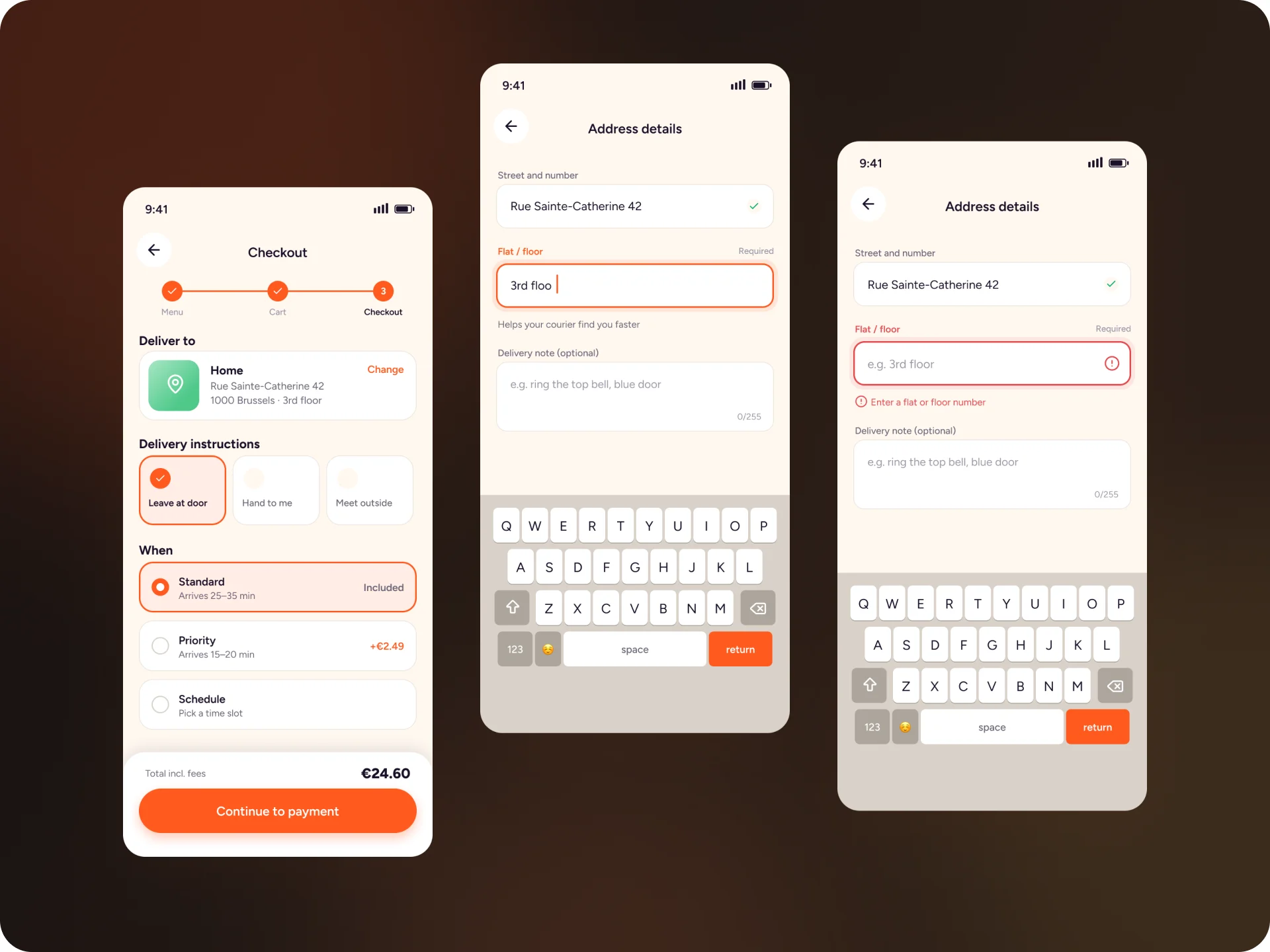
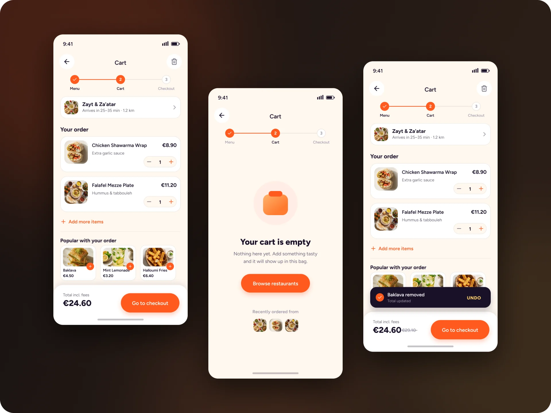
- The total sits on the left of a sticky bottom bar on every step, right next to the button that moves you on.
- A small step indicator at the top shows where you are, from the menu to the cart to checkout.
- Removing an item shows an undo toast instead of a confirmation dialog.
- An empty cart points back to restaurants and shows the places you ordered from recently.
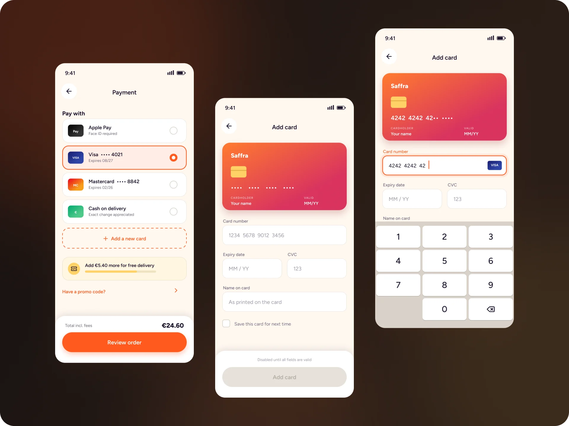
- Address and card fields were designed with the keyboard open, including focus and error states.
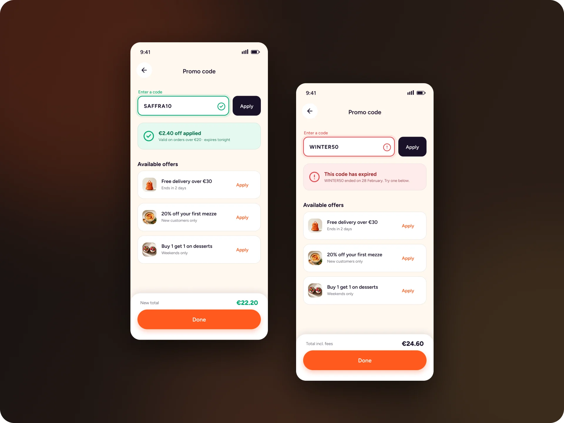
- An invalid promo code says why it failed, and the offers you can use sit right below it.
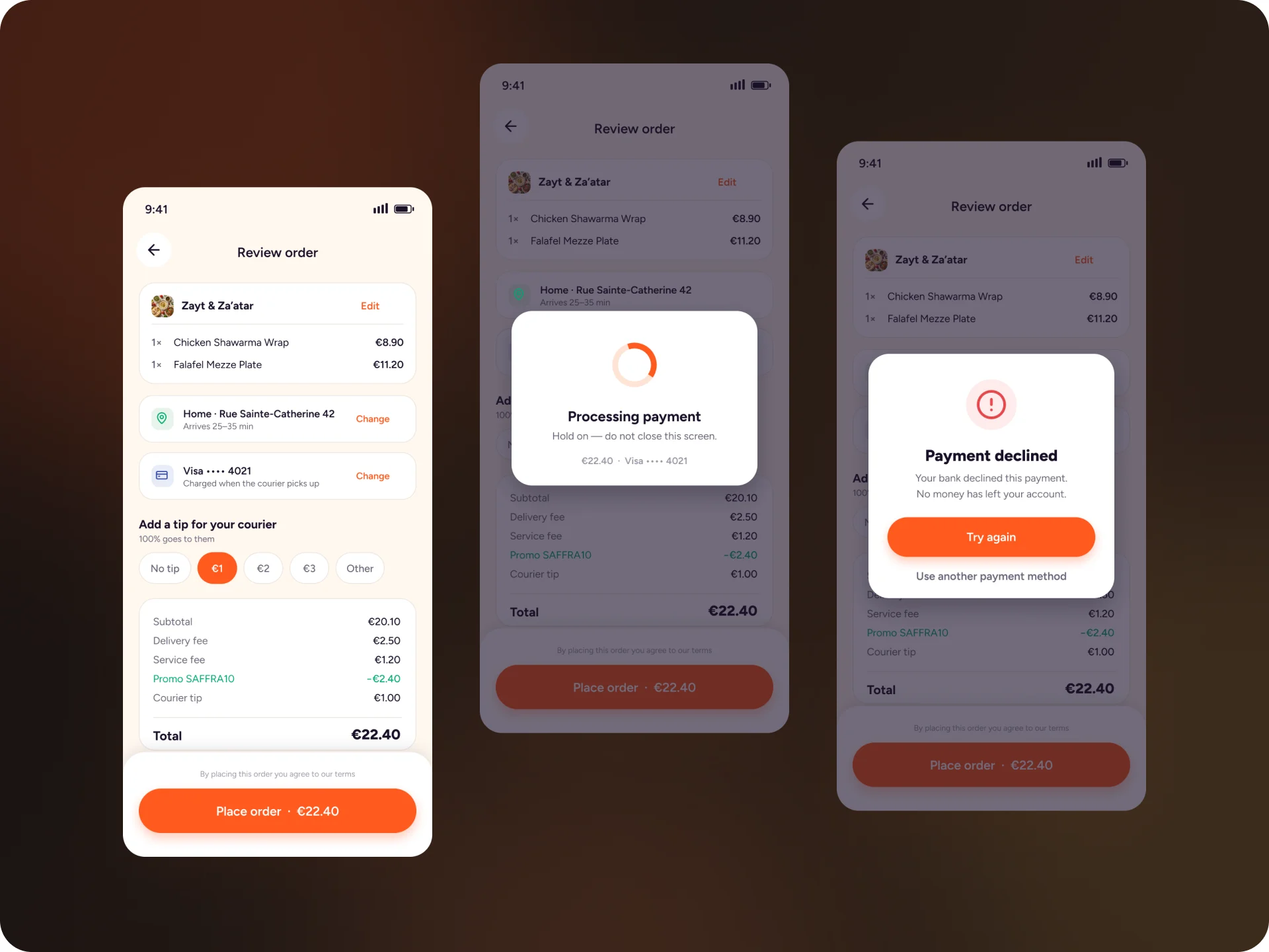
- The review screen names every cost, subtotal, delivery fee, service fee, promo, courier tip and total, and they add up to €22.40.
- If the bank declines the card, the order stays where it was. The screen says no money has left your account, with one button to try again and one to switch payment method.
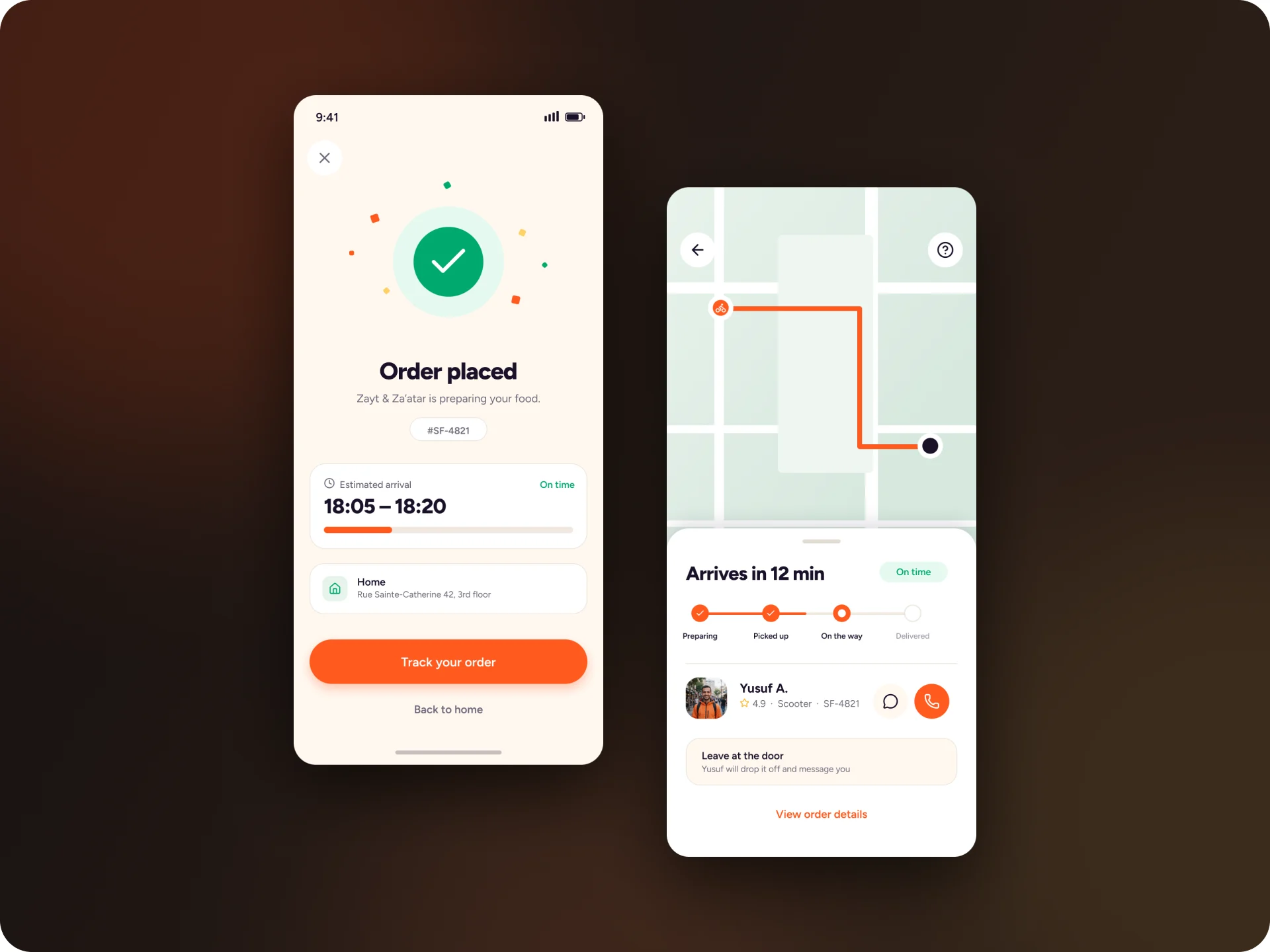
- After the order, the arrival window comes first, then live tracking with the courier and a way to call him.