Making crypto payroll as clear as a bank transfer
Rise pays contractors in 190+ countries, in fiat or crypto, and keeps every payment compliant. The engine worked, but the old interface didn’t explain it. I redesigned the product end to end, from onboarding to timesheets, and built the design system engineering ships from.
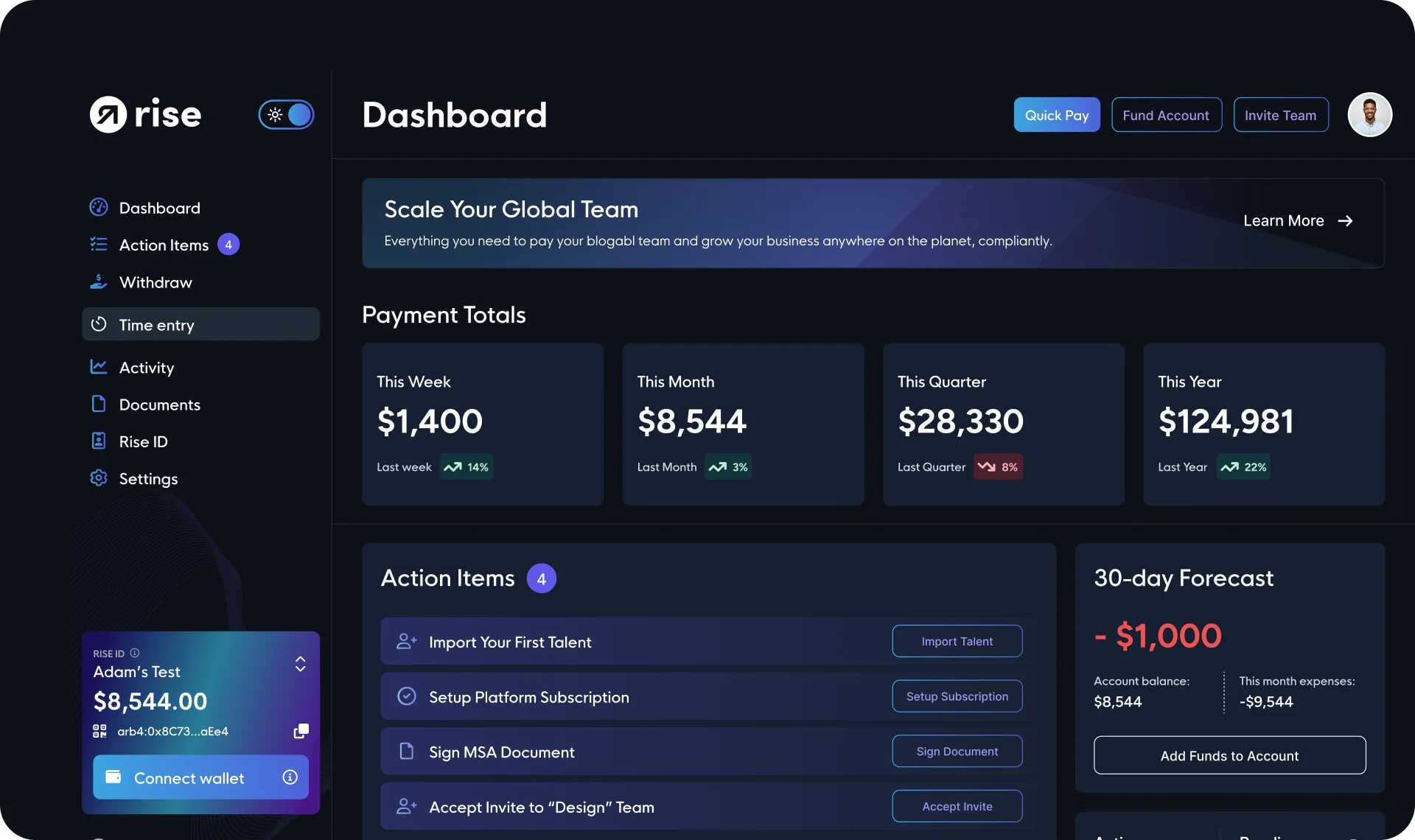
The work in numbers
- 70screens I designed, in light and dark
- 8product areas, from onboarding to timesheets
- 1:1Figma token to Tailwind class
Designing for two people at once
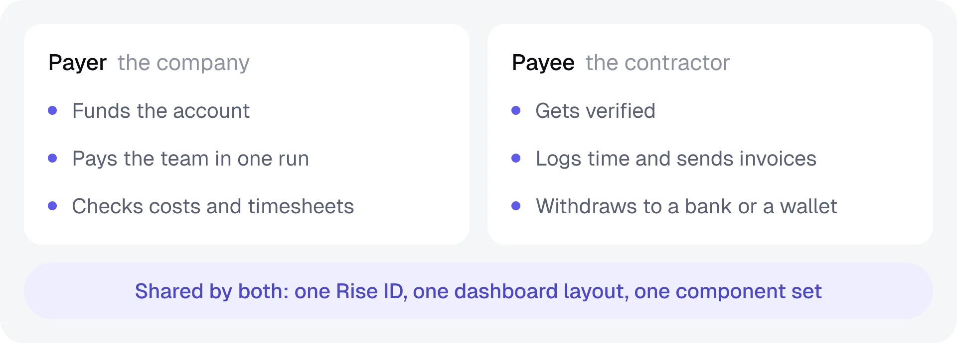
Every screen has two readers. The payer is a company funding an account and paying a team. The payee is a contractor who needs to get verified, log time and get the money out. Both share one Rise ID and one dashboard layout, so neither side learns a second product.
How I worked through it
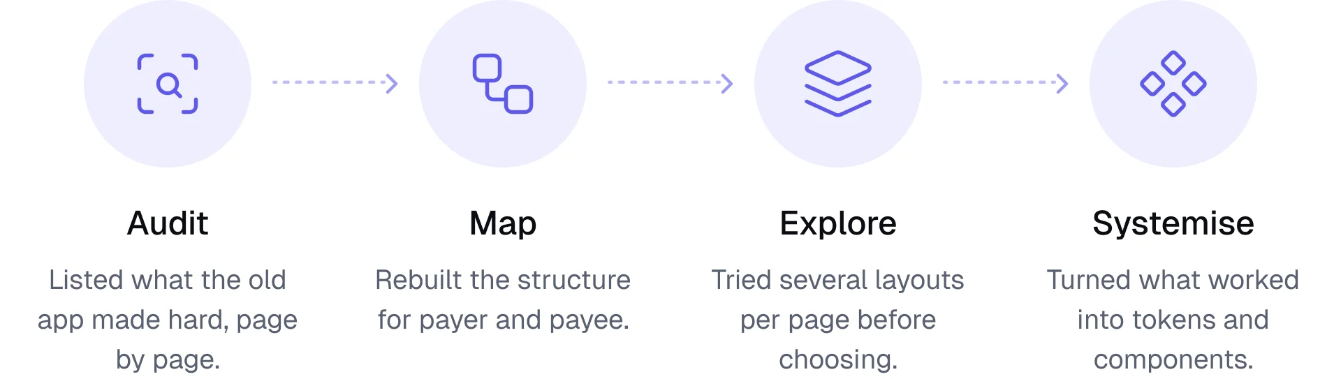
Four decisions that shaped it
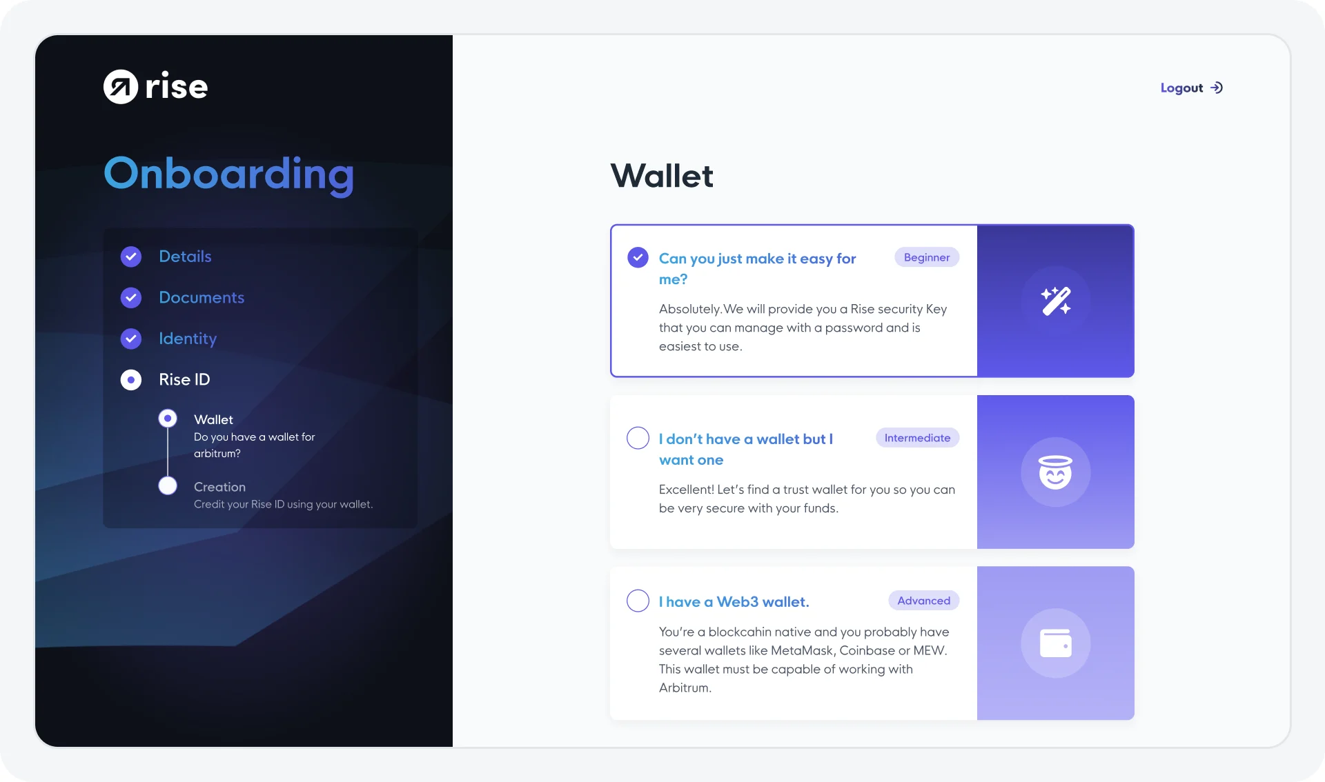
1Ask about crypto before assuming it
Most contractors have never owned a crypto wallet. Onboarding asks one question first. Make it easy for me, give me a new wallet, or I already have one. Beginners get a Rise security key they unlock with a password, and only people who bring their own wallet are asked about networks.
2Bank or wallet, one withdraw screen
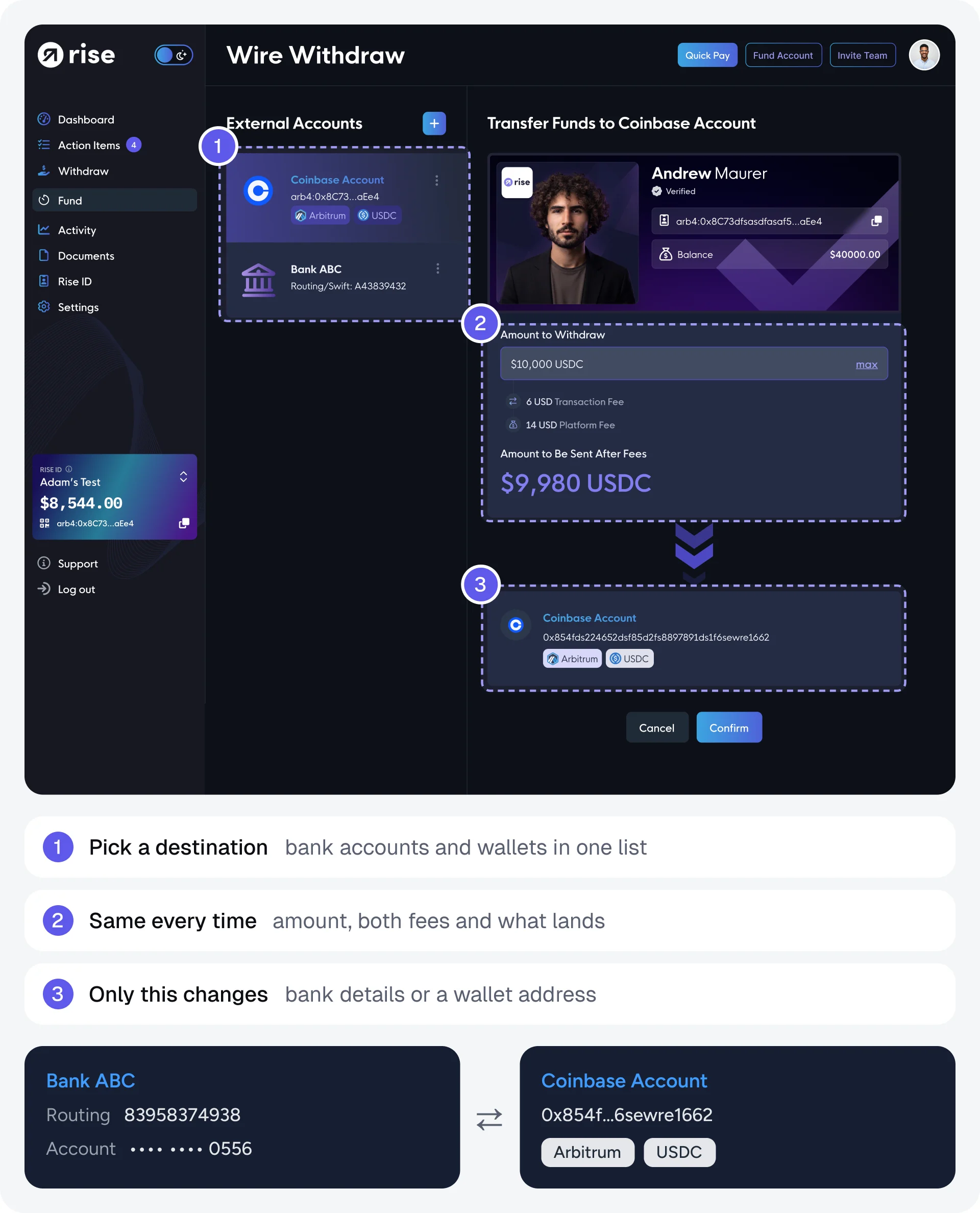
Bank accounts and wallets sit in one list. Pick either and the screen stays the same, showing the amount, both fees and what actually lands, all before Confirm. Only the destination block changes.
3A Rise ID that shows how far you are
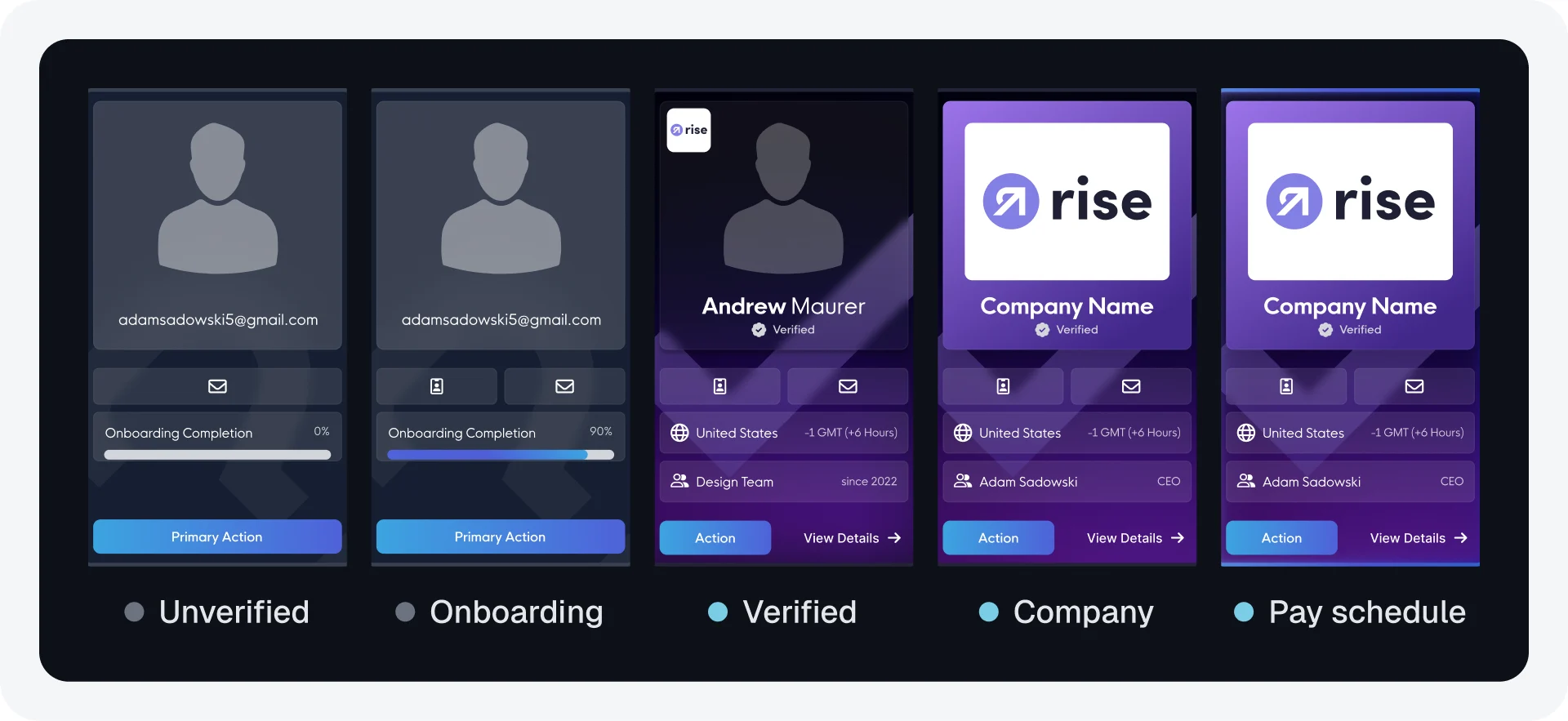
The Rise ID card is the user’s identity and login in one. It moves through five states, from unverified to a verified company with a pay schedule, so people can see what’s left before they can get paid.
4Timesheets that show where the time goes
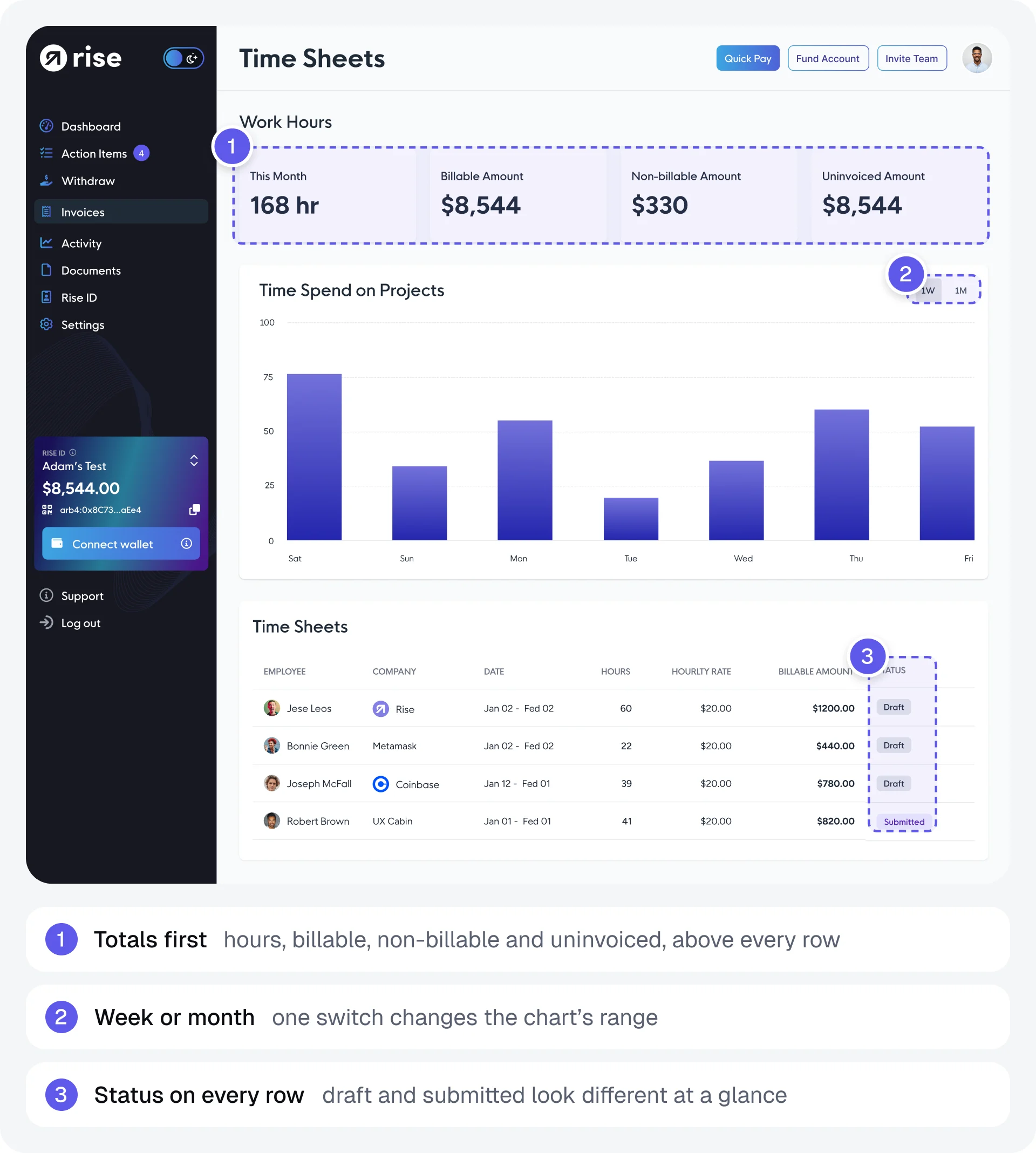
Payers open Timesheets to check hours before they pay. The page reads top to bottom, starting with this month’s totals, how the days compare, then each entry with its status.
A system engineers can build from
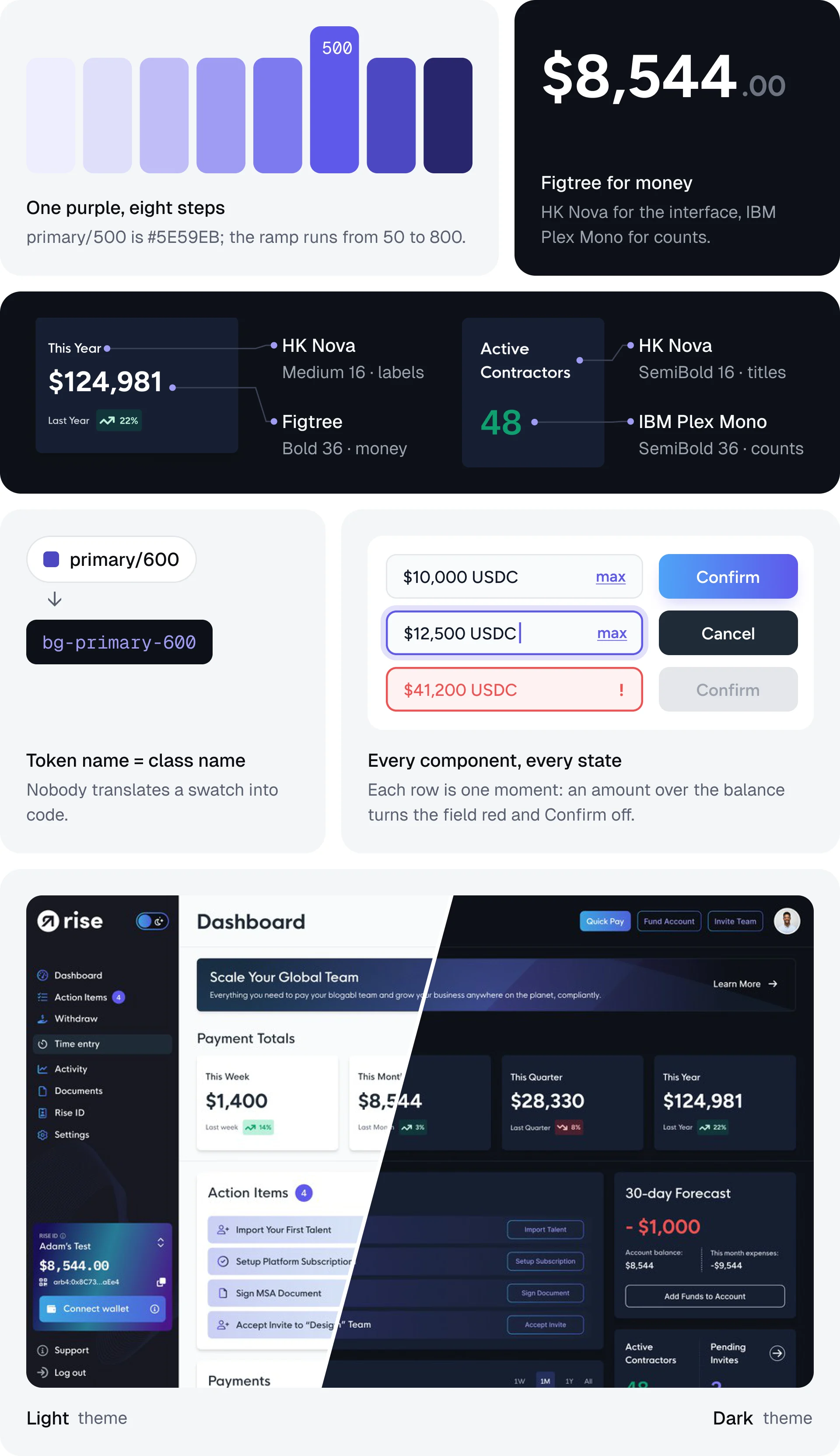
Every token is named after the Tailwind class it becomes. An engineer reads primary/600 in Figma and types bg-primary-600 in code, so nobody translates a swatch by hand. Both themes were drawn in full, for every component.
“The new design put us up on a pedestal compared to our competitors.”
What I carried forward
- 1Ask, don’t guess.One question at the start let each person skip the parts of crypto they didn’t need.
- 2Keep money screens identical.When only the destination changes, people check a bank wire and a crypto transfer the same way.
- 3Name tokens the way engineers type them.Nobody had to translate a swatch into a class name, so design and code stayed in step.