Saltpalm
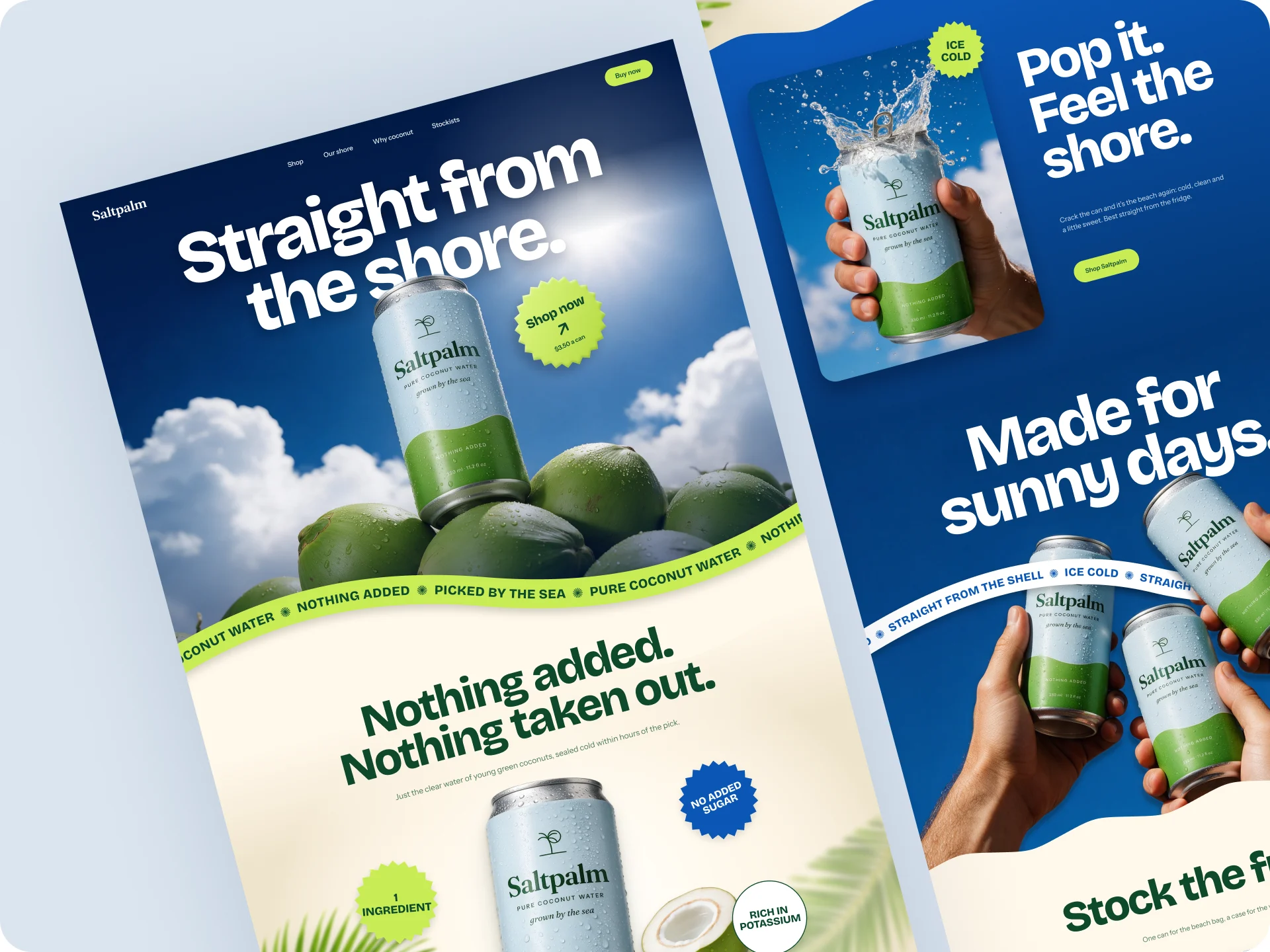
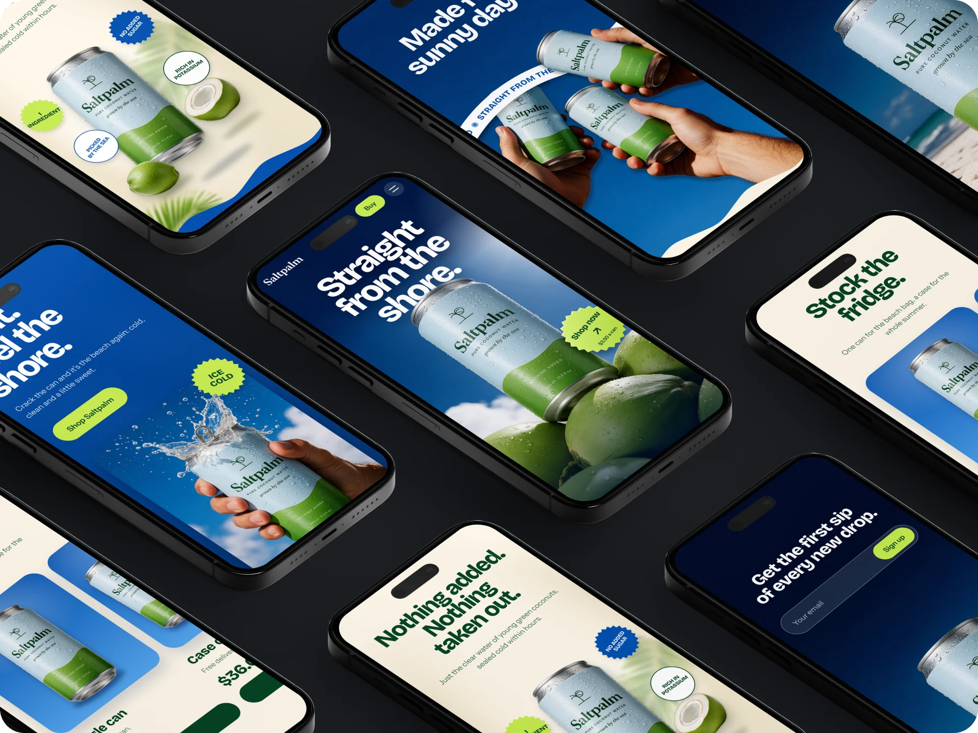
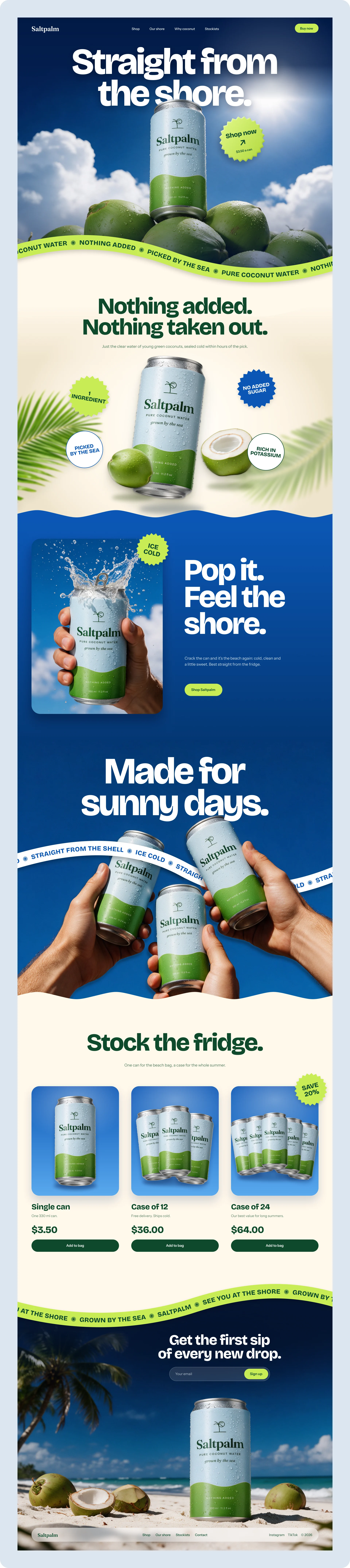
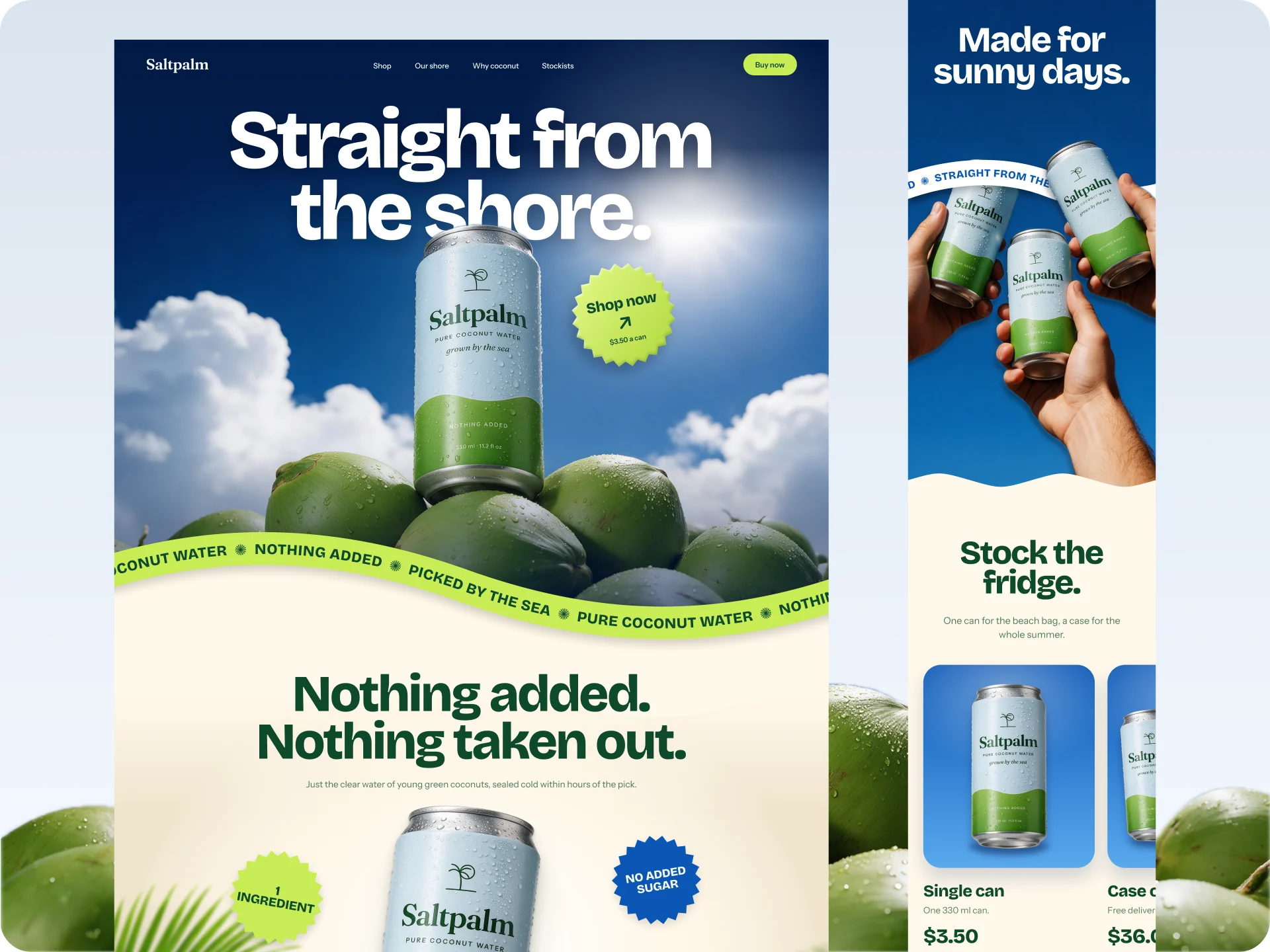
Saltpalm is a concept brand for a single product, pure coconut water in a 330 ml can. I designed the landing page for desktop and mobile from a 12-image moodboard, and an animated scroll prototype.
Challenge
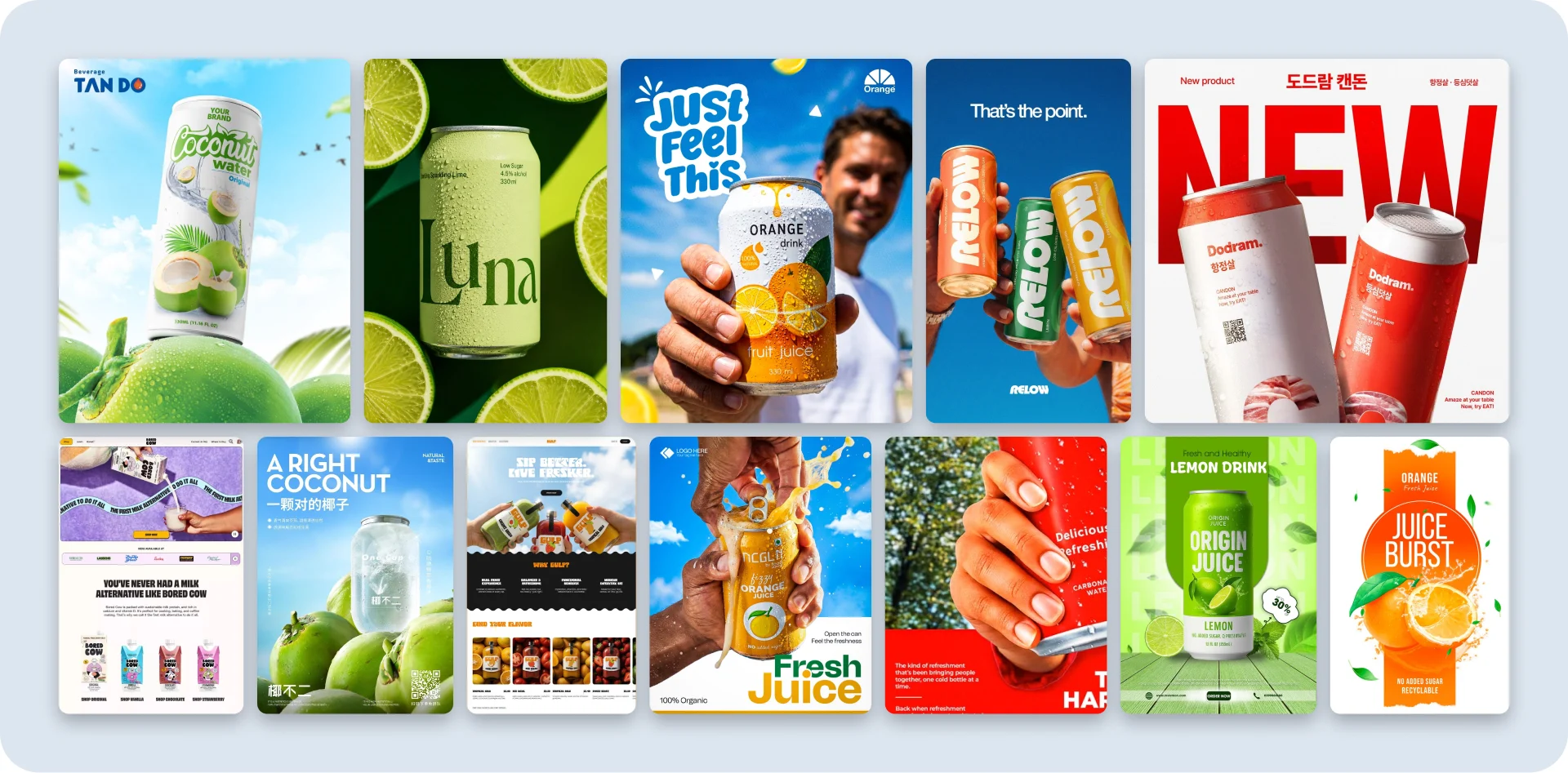
The moodboard was loud. Bright cobalt skies, heavy type wrapped around the product, hands pushing cans at the camera, stickers, splash and a wavy text ribbon. With a board like that it's easy to take only the colour and end up with a calm, pale page.
The challenge was to keep that energy over a whole page with a single product to sell, and to make sure the can never gets lost behind all the extras.
Solution
The board kept saying five things. A bright sky, heavy type, hands holding the can, loud little extras, and the product sitting on its source. Each one became a rule.
- The headline sits behind the can's lid in the hero, so the type and the product read as one poster.
- The only call to action in the hero is a sticker that says “Shop now, $3.50 a can”.
- Cobalt sky and cream take turns down the page. Lime only goes on things you can tap or need to notice.
- The green wave on the can label becomes the edge between sections.
- A wavy text ribbon shows up in three places, never two at once. In “Made for sunny days” it weaves through the hands holding the cans.
- Cut-outs get layered shadows, a soft glow behind them and film grain, so they sit in the photo instead of looking pasted on.
- The footer is a can standing in the sand, not a big wordmark.